The Ask
Brand an up-and-coming neurodiversity-affirming therapy practice providing quality music services to Brooklyn and the surrounding areas. The firm offers clinical, educational, and consulting services for all ages and neurotypes and is as a woman-owned and disable-owned business.


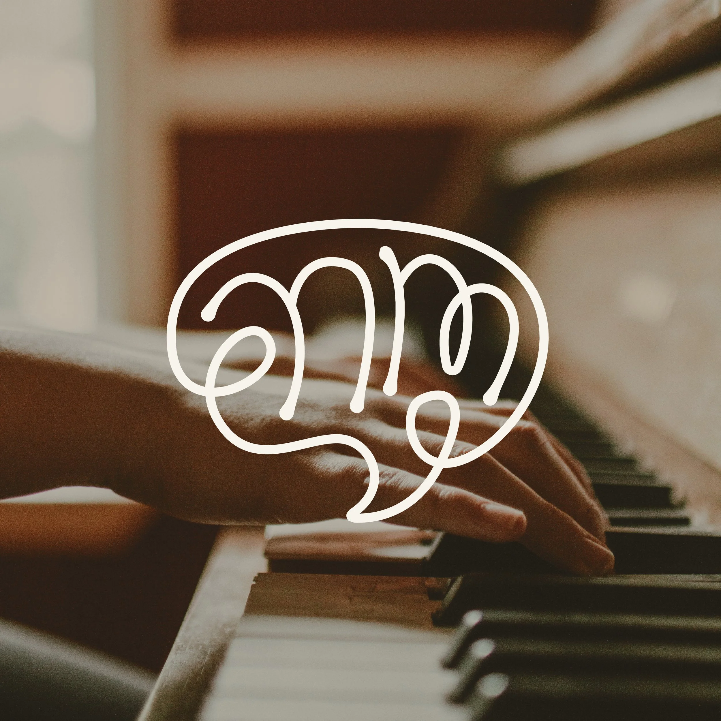
The Solution
Created a logo that focuses on refined and sophisticated line drawings. It feels light and airy and connects with clients of all ages. Abstract shapes are used to represent creativity and flow, while forming the shape of a brain.
Colors are light and airy but feel upscale and refined bringing a professional yet approachable look to the brand;
The Process
Provided client with a discovery document to help understand their brand, what they’re looking to accomplish and what they would consider a success.
Did brand research to see what other brands in the same space were doing to ensure this brand would feel unique.
Offered 3 unique looks for client to choose from that meet the needs of the business.
Refined chosen direction and provided various print, social and web assets to bring the brand to life.
The Team
Designer/Art directors: Kaylan Hufham, Curtis Kiser